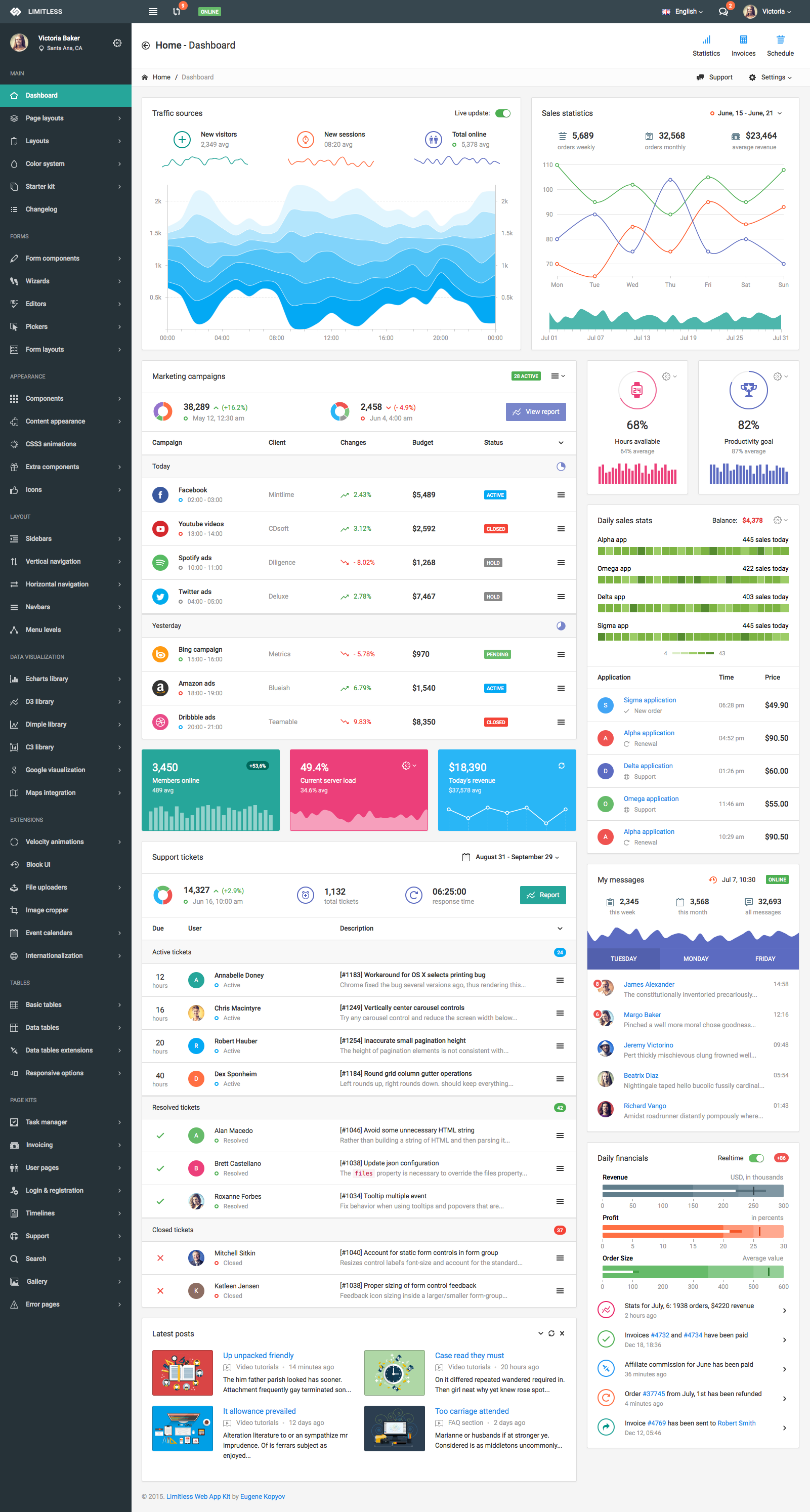
NoLimit是一款专业响应式Web应用后端开发工具包和管理后台模板,基于 Bootstrap 框架。NoLimit是一款功能强大且超级灵活的工具,最适合任何类型的 Web 应用程序。包括 1 个主要布局和 3 个替代布局、1000 多个带注释的 HTML 页面、1000 多个具有不同功能和选项的组件、100 多个插件和扩展等。NoLimit包括 Starter 工具包 – 一组空白页面,这将使您的开发人员的生活更加轻松。NoLimit模板是完全响应的,这意味着它在手机和平板电脑上看起来很完美。
NoLimit应用套件完全基于 LESS 预处理器,包括 100 多个带注释的 LESS 文件。每个文件对应一个组件、布局、页面、插件或扩展——因此您可以轻松找到必要的代码片段并根据需要对其进行编辑。该软件包包括从 LESS 编译的普通和缩小的 CSS 文件。
它还可以翻译——您可以即时更改应用程序语言并使用其他功能,例如备用语言、语言检测、直接访问等。要查看示例,请按照主导航。
导航在这里是一个强大的东西。它同时支持可折叠和折叠式垂直导航;具有状态保存功能的多级水平导航。水平导航用于导航栏和大型菜单。导航栏组件已扩展并添加了插件和组件支持(表单组件、按钮、链接、菜单、进度条等)。Mega menu 是另一首歌曲——它可以是任何颜色、任何宽度并包含任何内容。
页面和面板标题支持许多自定义选项,并且可以包含不同的组件,基本上它们都是可选的(意味着您可以通过在 LESS 文件中删除一行来轻松地将它们从样式表中删除)。
整体设计和谐、干净、用户友好。尽管模板内容很多,但看起来并不凌乱,所有文件和代码都结构良好,注释和划分良好。查看完整的功能列表并浏览所有页面。虽然这需要一些时间,但你不会错过任何东西。享受!
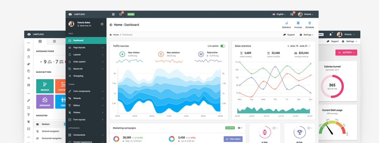
截图预览

主要功能
- 4 pre-built layouts
- Main – dark sidebar and navbars, white page header and breadcrumbs line
- Second – dark sidebar, light navbar, transparent page header and breadcrumbs line component
- Third – light sidebar, dark navbar, transparent page header. Sidebar is inside content area
- Fourth – 2 navbars, horizontal multi level navigation, transparent page header
- Static layout, fixed navbar, fixed footer and fixed sidebar layout options
- Custom and native scrollbars for fixed elemenets
- Liquid and boxed layouts
- Liquid – 100% width, up to 12 columns and up to 4 sidebars
- Boxed – fixed centered width, all options from liquid layout
- Custom color system, includes 16 color palettes
- Starter kit for developers – set of blank pages with basic functionality
- Form components
- Full set of basic form components
- Styled and native checkboxes/radios/file inputs, toggles and switches
- Input groups in different sizes, colors and components
- Twitter typeahead integration, including Bloodhound engine
- Elastic textarea
- Masked inputs
- Input formatters
- Password generator and password strength indicator
- Characters counter and limiter
- Form action buttons
- Tags inputs with Typeahead and copy/paste support
- Dual multiple select boxes with single and multiple selections
- Editable form elements with enhanced support of components and input types
- Form validation
- 12 columns responsive grid of input fields
- Vertical and horizontal form layouts
- Selects
- Select2 select library with advanced options
- Bootstrap Multiselect library with different options
- SelectBoxIt selects library with sizing, styling and other options
- Bootstrap Select library with live search support
- Wizards
- Stepy wizard library
- Form wizard library
- Steps wizard library
- Editors
- Summernote rich text editor
- CKEditor text editor, the most powerful one
- WYSIHTML5 text editor
- Ace Code editor with 100+ modes, themes and extensions
- Pickers
- Date & time – pick-a-date, pick-a-time, anytime, daterange and jQuery UI pickers with options
- Spectrum Color picker with options
- Location and address pickers with Google Maps integration
- Date paginator – date picker with calendar and pagination
- Components
- Modal dialogs with enhanced options
- Dropdown menus with advanced styling
- Tabs and pills components with options
- Collapsible and accordion components
- Nav component with options
- Buttons with styling options and loading spinners/progress bars
- Tooltips and popovers with options
- Different display options for alerts
- Pagination with styling and sizing options
- Pager with styling and sizing options
- Labels and badges, including styling options
- Progress bars in different sizes and styles
- Page and component loaders with icon spinners and custom loaders
- Thumbnails with titles, descriptions, components and other options
- Page header component with supported sizes, styles and elements
- Breadcrumbs component with supported styles and elements
- Media lists with options
- jQuery UI and NoUI sliders with pips, tooltips, color and size options
- Syntax highlighter with language options
- Affix and scrollspy components
- Dynamic tree views with different options and data sources
- Context menu extension
- Notifications
- PNotify notifications library
- Noty notifications
- jGrowl notifications
- Content panels
- Panels component with all available options
- Draggable and sortable panels feature
- Available panel heading components and styling
- Appearance
- Available text styling
- Lists, blockquotes, well blocks, headings and heading components
- Table with available helper classes
- 12 columns responsive grid demonstration
- CSS3 animations based on animate.min.css library
- Icons
- Basic Bootstrap’s Glyphicons icon font set
- Default Icomoon icon set
- Optional Font Awesome library
- Extensions
- Session and idle timeout tools
- Velocity.js animations, including UI pack
- BlockUI library for blocking elements
- Image cropper with options
- Fullcalendar library with styling and display options
- Internationalization library with examples and options
- File uploaders
- Plupload multiple file uploader
- Dropzone single and multiple file uploader
- Bootstrap file input – single and multiple file uploader
- Sidebars
- Collapsible and hideable default width sidebar
- Collapsible and hideable mini width sidebar
- Secondary sidebar with appearance options
- Opposite sidebar sith appearance options
- Left, right and sticky detached sidebars
- Dual and double sidebars options
- Light and dark sidebars color option
- Hidden sidebar by default
- Available components adapted for use in sidebar
- Vertical navigation
- Collapsible navigation
- Accordion navigation
- Optional navigation sizing
- Bordered navigation style
- Left and right icons positions
- Ability to disable certain navigation items
- Up to 4 levels, can be extended
- Horizontal navigation
- Open submenu levels on click
- Open submenu levels on hover
- Examples of horizontal nav with custom components
- Using tabs in horizontal navigation
- Ability to disable certain navigation items
- Horizontal mega menu with components and options
- Navbars
- Single top or bottom, static or fixed navbars
- Multiple navbars
- Different multiple navbars positions
- Navbar as a stand alone component
- Navbar colors options
- Navbar sizing options
- Top and bottom hideable navbars
- Navbar components
- Main, secondary or both navbars fixed
- Data visualization
- Native D3.js library charts
- ECharts library with available chart types
- Dimple library, built on top of D3.js
- C3 library, built on top of D3.js
- Google Charts library
- Google maps with options and core features
- Vector maps with visualization options
- Static tables
- Basic examples of available table options
- Table sizing options
- Table borders
- Table styling
- Table components
- Responsive tables
- Data tables
- Basic initialization examples
- Datatables styling
- Advanced examples
- Sorting options
- Datatables API usage examples
- Data sources examples
- Responsive data tables
- Columns reorder extension
- Fixed columns extension
- Columns visibility extension
- Table tools extension
- Scroller extension
- Custom pages kit
- Task manager – list and grid display options, detailed task page
- Invoicing – static, editable invoice, invoice grid and archive
- User cards and user list
- User profiles with and without cover image
- Simple and advanced login forms
- Simple and advanced registration forms
- Unlock user, password recovery forms
- Login/registration styling options
- Left, right and centered timeline
- Chats layouts and color options
- Knowledgebase and FAQ pages
- Search pages kit – mixed, users, images, videos
- Media gallery with optional titles and descriptions
- Set of error pages – 403, 404, 405, 500, 503 and offline page

